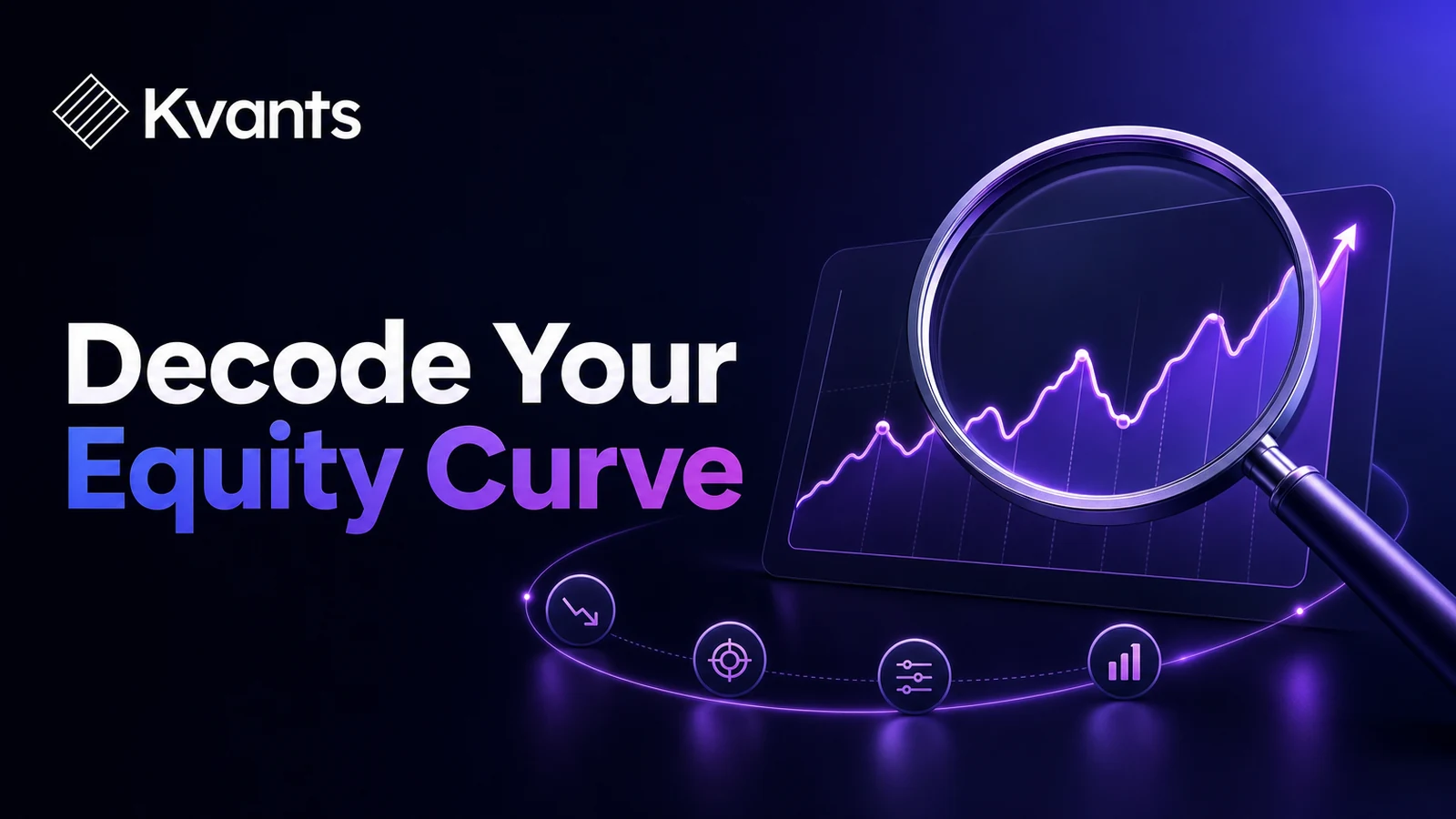
Learn how to analyze a trading equity curve for drawdowns, concentrated gains, regime dependence, cost sensitivity, and weaknesses hidden by the final result.
Quick Answer
Equity curve analysis examines how trading results accumulated rather than looking only at the ending account value. First verify the data, cash flows, position sizing, and trading costs. Then measure drawdown depth and duration, rolling performance, gain concentration, exposure, and results across market conditions. Finally, stress uncertain execution assumptions. The main limitation is that an equity curve describes one observed path; even a stable historical curve cannot establish what will happen next.
Key Takeaways
- Analyze the path of returns, not only the final gain or loss.
- Measure both drawdown depth and the time required to recover.
- Check whether a few trades, symbols, or periods produced most gains.
- Use rolling windows to expose deterioration hidden by full-sample averages.
- Rebuild the curve with realistic costs and less favorable execution assumptions.
- Treat the curve as diagnostic evidence, not proof of a durable edge.
What a Trading Equity Curve Measures
An equity curve plots account value or cumulative trading results across time or trade sequence. The vertical axis may show currency, percentage return, account equity, or risk units such as R.
Two versions are particularly useful:
- Closed-trade equity: Updates when positions close and reflects realized results.
- Mark-to-market equity: Includes unrealized gains and losses while positions remain open.
A closed-trade curve can appear stable even if open positions experience large adverse moves. A mark-to-market curve reveals more of the path, but it requires sufficiently detailed and reliable price data.
The calculation must also match the sizing policy. For a strategy that risks a percentage of current equity, account value compounds sequentially:
Equity_t = Equity_(t-1) × (1 + return_t)
For a fixed-risk strategy, cumulative R can make signal quality easier to inspect independently of account size. One R represents the amount initially risked on a trade. However, an R curve does not recreate the effects of changing position size as equity rises or falls.
There is no universally correct representation. Use the curve that reflects the sizing and valuation method you could actually follow, and inspect both closed and mark-to-market equity when the necessary data is available.
A strategy laid out end to end in the Kvants editor.
Why the Final Result Can Be Misleading
Two strategies can finish with the same net gain while exposing a trader to very different paths.
One might advance gradually with several moderate drawdowns. Another might remain below its starting value for most of the test before recovering through two exceptional trades. The endpoint is identical, but the dependence on outliers, required patience, and capital risk are not.
A headline result can also conceal:
- recent deterioration after an initially strong period;
- gains concentrated in one market regime;
- increased position size late in the test;
- one dominant symbol, direction, or session;
- large unrealized losses between entry and exit;
- omitted commissions, spreads, slippage, or funding charges;
- deposits incorrectly recorded as trading gains.
The objective is not to find a perfectly smooth line. Real trading strategies experience losses and drawdowns. Equity curve analysis asks what created the result, how fragile that result is, and whether the path fits the trader’s constraints.
A Step-by-Step Equity Curve Analysis Workflow
1. Verify the underlying records
Confirm that each trade has consistent timestamps, instrument, direction, quantity, entry, exit, fees, and realized outcome. Separate trading results from deposits and withdrawals or adjust returns for external cash flows.
Include relevant commissions, spreads, slippage, funding charges, and borrow costs. A frictionless curve is a research baseline, not a realistic implementation estimate.
When positions overlap, preserve the order in which orders and fills could have occurred. Sorting only by exit time can misrepresent capital usage and concurrent risk.
2. Match results to position sizing
Determine whether the test used fixed units, fixed currency risk, or a percentage of changing equity. Do not combine records produced by different policies without normalizing them.
A curve may accelerate because exposure increased rather than because the signals improved. Review position size, gross exposure, and total open risk alongside the equity line.
3. Measure drawdown depth and duration
Drawdown is the decline from the previous equity peak. Percentage drawdown at time t can be written as:
Drawdown_t = (Equity_t − Peak_t) / Peak_t
Record more than maximum drawdown. Identify the previous peak, the lowest point, the number of trades or days underwater, and whether the decline had recovered by the end of the sample.
Duration changes the practical meaning of risk. A relatively shallow decline lasting a year may be harder to follow than a deeper decline that resolves quickly. A long unrecovered period can also reveal deterioration before maximum drawdown reaches an unusual level.
4. Inspect rolling performance
Full-sample metrics average strong and weak periods together. Recalculate key measures over rolling windows, such as every 20, 30, and 50 trades when those lengths are appropriate for the strategy’s frequency.
Useful rolling measures include expectancy, win rate, average win, average loss, profit factor, trade frequency, costs, and maximum drawdown within each window.
Use multiple reasonable window lengths. Selecting a single window after viewing the results can create a misleading picture of stability.
5. Test gain concentration
Rank trades by their contribution to the total result. Ask:
- How much came from the five largest winners?
- What remains after removing the largest trade?
- Are gains concentrated in one symbol, year, session, or direction?
- Did one event or market shock dominate the sample?
Outlier dependence is not automatically defective. Some trend-following approaches are designed around infrequent large moves. The concern is whether the sample contains enough independent opportunities to estimate that payoff pattern with useful confidence.
6. Segment by market context
Break the record into conditions that could plausibly affect the strategy, such as high and low volatility, rising and falling markets, different sessions, or separate instruments.
Use segmentation first as a diagnostic tool. If a proposed regime filter is created after inspecting all losses, it must be validated on unseen data or through a walk-forward process. Otherwise, the filter may simply encode historical noise.
7. Stress the uncertain assumptions
Recalculate the curve under plausible adverse conditions:
- higher commissions or slippage;
- an entry delayed by one bar;
- conservative priority when a stop and target occur in the same candle;
- occasional missed trades;
- less favorable fills for thinly traded instruments;
- limits on simultaneous positions.
The strategy does not need to survive every extreme scenario. It should not depend entirely on one optimistic assumption that cannot be reproduced in practice.
A backtest's equity curve and trade-by-trade log.
Worked Equity Curve Analysis Example
Consider a hypothetical 120-trade backtest ending at +18R. Further analysis finds:
- the first 20 trades produced +12R;
- the following 100 trades produced +6R;
- the three largest winners contributed 11R;
- maximum closed-trade drawdown was 6R;
- two recent 30-trade windows had negative expectancy;
- estimated costs of 0.05R per trade reduced the result by 6R.
After modeled costs, the result falls to +12R. Removing the three largest winners from the original record leaves +7R.
These findings do not prove that the strategy has failed. They identify specific research questions. Are the large winners an expected part of its payoff distribution? Did later trades occur in a different market environment? Are the cost estimates representative of the intended instruments and order types?
The next step should not be to add filters until the curve looks smoother. Test each explanation on additional unseen periods. If changing one parameter or fill assumption erases the result, the apparent edge may be too fragile for deployment.
Common Equity Curve Failure Modes
Judging quality by visual smoothness
A smooth line can result from infrequent valuation, hidden unrealized losses, or rules fitted closely to historical data. A jagged curve can still be usable if its risks and payoff distribution fit predefined limits.
Ignoring exposure
A moderate gain may require nearly continuous exposure or several correlated positions. Review time in the market, overlapping trades, gross exposure, and portfolio heat rather than assessing the curve in isolation.
Editing rules after every drawdown
A drawdown does not automatically mean the strategy stopped working. Compare it with tested historical behavior, then check rule adherence, market conditions, data quality, and execution before changing the strategy.
Reusing the same sample
Every adjustment made after viewing the full curve consumes information from that sample. Repeatedly modifying rules against the same history encourages overfitting, even when each individual change sounds reasonable.
Comparing curves with different risk
A steeper curve may simply reflect larger positions. Normalize results by initial risk, volatility, or another consistent exposure measure before attributing the difference to signal quality.
Investigating the Curve in Kvants Studio
In Kvants Studio, traders can turn plain-English ideas into editable, auditable strategy logic and test them using NautilusTrader’s event-driven engine. Keeping entry, exit, sizing, and execution rules explicit makes it easier to trace an equity-curve weakness back to a particular assumption.
Parameter sweeps can show whether the result depends on one narrow setting. Walk-forward analysis can evaluate sequential development and test periods, while crisis-stress validation can examine behavior during selected market disruptions. A controlled paper workflow can then help assess whether signal timing and execution remain practical outside the historical simulation.
Use these methods to investigate a defined concern rather than optimize every irregularity away. The Kvants documentation explains the platform workflow, and the Kvants blog covers related validation topics. These research tools do not establish that historical behavior will continue.
Kvants audits that the engine runs the strategy you configured.
Frequently Asked Questions
What does a good trading equity curve look like?
There is no universal shape. A usable curve has drawdowns, recovery periods, return concentration, and exposure consistent with the strategy’s design and the trader’s limits. Stability across independent periods matters more than visual smoothness.
Should I use closed-trade or mark-to-market equity?
Use both when possible. Closed-trade equity shows realized outcomes. Mark-to-market equity reveals risk experienced while positions remain open and is especially important for strategies with long holding periods, overlapping positions, or wide stops.
How many trades are needed for equity curve analysis?
There is no fixed threshold. The sample needs enough independent trades and varied conditions to examine rolling performance, drawdowns, and concentration. Thousands of highly related trades from one market regime can still provide weak evidence.
How often should I review a live equity curve?
Set a schedule based on strategy frequency, such as monthly or after a predefined number of trades. Avoid changing rules after every loss. Investigate only when predetermined risk, execution, or process thresholds are breached.
Can an upward equity curve still indicate a weak strategy?
Yes. The result may depend on a few outliers, one favorable period, rising exposure, omitted costs, unrealistic fills, or accidental use of future information. The curve’s construction and path matter as much as its endpoint.
Risk Note
This article is educational and is not investment advice. Trading involves risk, including the possible loss of capital. Equity curve analysis cannot predict future returns, and backtested performance does not guarantee future results. Use realistic assumptions, independent validation, and risk limits appropriate to your circumstances.